I was first introduced to burn-down charts without knowing that’s what I was seeing. I was attending a monthly chapter meeting of the Project Management Institute (PMI) and the guest speaker was presenting his methods for tracking and managing projects. What he demonstrated fascinated me to the point that I contacted the Vice President of Programs to get a copy of the presentation. From there I reverse engineered the charts to come up with an Excel spreadsheet that I could plug numbers into and get that result.
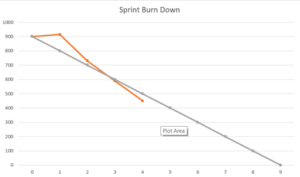
It was a couple of years later when I was beginning my study of Scrum that I found these types of charts were called burn-down charts. Basically, these charts plot the ideal rate at which work should be completed over the course of a sprint. This is determined by taking the number of points committed to during the sprint, dividing those by the number of days in the sprint and plotting the slope of that line from day 1 to day N of the sprint. Then, each day the number of remaining points for the sprint is plotted on the chart to show at a glance where the development team is in relation to the baseline.
 The Scrum Master is responsible for updating the burn-down chart each day immediately following the daily stand-up/Scrum meeting. The chart is published in public view so that team members and stakeholders can easily find it and review it.
The chart has points on the Y-axis and days on the X-axis. If the performance line (Orange) is above the baseline (gray) then the team is behind. If the performance line is below the baseline the team is ahead in the sprint.
There is typically an irregular pattern day to day in the performance line. It does not typically follow a smooth progression but ideally, it should track closely to the baseline. If there is a large departure from the baseline the Scrum Master should step in to determine what the cause is and what can be done to correct the issue.
This can happen if the team either gets substantially behind OR ahead.
If the team is ahead it may be possible to add additional user stories to the sprint so the team can deliver even more value than the Product Owner would be expecting during the sprint.
If the team is significantly behind conversations about what needs to come out of the sprint may be necessary. This may mean stopping work in progress on some user stories to swing that capacity to address higher value user stories that are at risk of not being completed during the sprint. This approach ensures that the sprint always delivers the highest value possible even if not all commitments initially planned for the sprint will be achieved.
These conversations usually follow immediately after the daily standup or Scrum meeting as a problem-solving session for the team. They should always involve the Scrum Master and the Product Owner and can be expanded to include members of the development team and additional stakeholders as needed to make the ultimate decision.
In summary, the burn-down chart makes it possible for the Scrum Master, the Development Team, the Product Owner and all Stakeholders to quickly read and understand the status of the team’s progress every day. Issues immediately surface which allows the team to swarm to them and resolve them before they impact the success of the sprint.
If you are interested in the Burn-Down Chart Spreadsheet Tool that I’ve created to generate these automatically, please sign up for my email updates. Subscribers receive my Kanban for Excel tool as a thank you from me.
Question: Have you used burn-down charts before? What was the result? Leave your responses in the comments below. I’m interested in how valuable this has proven to be for other teams.


